Friday, November 30, 2007
Final Year Studio - Research - Railway Film Depiction
Videos courtesy of BBC Motion Gallery
Above are various angles of depiction used in the industry of film to convey the power and speed of the railway. The top video has been taken using a long angled shot, the next one down a medium angled shot, and the one after that a low angled shot. The bottom video is that of a modern underground railway and depicts the speed and volume of people that use it to move around the city. These videos just help me to understand the strong association the railway has had with the development of aesthetic technology and the feelings it stimulates within the viewer.
Final Year Studio - Research - Bandwidth - Mechanical Scanning

Installation courtesy of the National Media Musuem, originally uploaded by Jimbo (Alan James Wellock).
In my Datamotives idea I use a digital medium to affect a analogue medium, above is the same but the other away around. Mechanical scanning allows simple images created on screen. A 'Nipkow disk' which houses a spiral of holes punched through it, each containing a single line of the image. The disc then spins and each hole is read, creating an overall image on the screen. It doesn't have the most widest of bandwidths but it a very good example of a physical object effecting a virtual object.
Final Year Studio - Research - Bandwidth

Installation courtesy of the National Media Musuem, originally uploaded by Jimbo (Alan James Wellock).
On my visit to the National Media Museum in Bradford I came across a simple installation that explained the idea of 'bandwidth' in relation to television signals. In the case of television the term bandwidth refers to how much space is available to send information using a signal. Obviously early television pioneers had very little bandwidth, but as it developed more and more became available, for example today they have enough bandwidth to reproduce high definition images. The above two images show visually the difference between high and low bandwidth. The top image as high bandwidth and in turn is very sharp. While the bottom image has a very low bandwidth, resulting in a blurry image.
Thursday, November 29, 2007
Final Year Studio - Development - Servo Motor Control

Above is a single servo experiment that allows the computer to control the speed of rotation of its arm and its start and reset position. Although on a small scale this experiment is key to the development of my project, the next step will be to set up multiple servos and then using ASCII references from the keyboard, get their arms to rotate to specified positions. This will be the core motion and coding for my analogue style screen for displaying the arrival of a website into the 'station.' This will hopefully then emphasise the massive data and associative bandwidth differences associated with digital and analogue mediums as well as adding to aspect of something 'arriving.'
Final Year Studio - Development - DC Motor Control

Since my idea will involve using both digital and analogue mediums I have been experimenting with motors in Spencer's class. Above is a setup that powers a DC Motor and controls the direction in which it rotates, using the mouse's 'y' position on screen. This experiment was undertaken to give me a greater understanding of how to both power the motor from the breadboard and use variables to send out data to the Arduino board to control it. I need to take that knowledge now and apply it to Servo motors, a key piece of technology that will allow me to create an analogue style screen system.
Friday, November 23, 2007
Final Year Studio - Research - Data Mapping Visualisation - Site Manager

Image courtesy of http://www.cybergeography.org/, originally uploaded by Jimbo (Alan James Wellock).
Above is an actual commercial data mapping application used for mappring Internet traffic for a large corporation. As you can see it uses simple lines and tag titles in conjunction with a sphere to create a simple virtual world.
Click here for wesbite
Final Year Studio - Research - Data Mapping Visualisation - Webtracer

Image courtesy of http://www.cybergeography.org/, originally uploaded by Jimbo (Alan James Wellock).
Above is another application that maps the Internet in a three dimensional world, allowing the user to then navigate this world of hyperlinks and highlight various nodes to interact with.
Click here for website
Final Year Studio - Research - Data Mapping Visualisation - TouchGraph

Image courtesy of http://www.cybergeography.org/, originally uploaded by Jimbo (Alan James Wellock).
TouchGraph is an actual fully functional navigation system for searching through data visually on the Internet. TouchGraph believe that to most efficiently navigate through the vast amount of data on the Internet it is better to see the 'big picture' and how each website is connected, rather than linearly scrolling down a webpage. This shows the user how the information relates to each other, easing the use of the Internet. Using the search engine Google, the Java applet animates and grows website nodes, connecting each one up to its originator along the way. Since this is a fully functional program it is very easy to use as you originally just type into a search box to start the search. The results are hard to decipher at first due to the continuess conditioning of such linear search engines as Google itself has had on us the digital users. Once you understand it though its becomes a good alternative to usual search engines, and thanks to visual connections it seems to let you decipher the data quicker as it works very simlar to how your actual brain works.
Final Year Studio - Research - Data Mapping Visualisation - Web Forager/WebBook

Image courtesy of http://www.cybergeography.org/, originally uploaded by Jimbo (Alan James Wellock).
In my sketchbook I talked about an idea that involved digitising a book and lower down I also mentioned about creating a book of website to investigate the simlarities and differences in navigating through the physical and digital world. This is a similar idea, but digital, where each webpage is book and each whole website is an whole book shelf of various books. The main aim is to give the user a digital space not unlike the one he or she is used to in the physical world. The results in a three dimensional virtual world with a desk so the user can select and flip through various books (websites). It uses the 'framing' and 'associate bandwidth' we associate with our real world activities for navigating through information, giving the interactivity of the piece an almost 'pick up and play' feel.
Click here for website
Final Year Studio - Research - Data Mapping Visualisation - City of News

Image courtesy of http://www.cybergeography.org/, originally uploaded by Jimbo (Alan James Wellock).
A very different way of looking at the Internet was created by MIT's Media Lab. City of News is a three dimensional browsing system for navigating a digital network as you would a physical cityscape. It works very much like the VisitorVille application but has an 'iPod advert' feel to it. This piece interests me because like the real world, as you can see from the image above, you cannot see the whole structure, the three dimensional buildings obstruct the viewing of various other websites (buildings). This is a kind of real world restriction very much like the time restriction in my idea, it makes you think about how you use the Internet. For example unlike the real world when you view a website (object) thanks to the Internet Browser, the 'framing' or 'associate bandwidth' is always the same, the amount of light or time of day doesn't effect the virtual world.
Final Year Studio - Research - Data Mapping Visualisation - GeoURL

Image courtesy of http://www.cybergeography.org/, originally uploaded by Jimbo (Alan James Wellock).
GeoURL is very simple in theory. It is a tool created by Bjorn Hanson that uses your IP address where which your website is stored at to visualise the Internet on an actual world map. This then allows you to navigate the Internet not by subject appropriatness but physical location. It allows you to find URLs in proximity to a given location, directly linking the digital world with the physcial. It almost treats data as a unique object by giving it an 'home.' It is an idea closely linked to mine, but instead of the geographical aspect of where data is stored I am interested in the time in which data can be accessed in the virtual world compared to navigation of the physical, by combining the two.
Final Year Studio - Research - Data Mapping Visualisation - Cybergeography

Image courtesy of http://www.cybergeography.org/, originally uploaded by Jimbo (Alan James Wellock).
Above, inspired by subway transport maps, is just one of various posted on the Cybergeography website, a research site dedicated to the mapping and graphic visualisation of new electronic environments, including the Internet. 'Cybermaps' are visual representations of data traffic and help both large corporations and individuals understand 'new digital landscapes beyond [their] computer screen.' The main aim of them is the same as maps of our realworld, to help us navigate efficiently around an environment. Producers of these tools are called 'Cyber-explorers.' They create maps that follow both geographical conventions and abstract ideals. Above are just some that I find useful to inspire both the visualisation of my idea and its development as an investigation.
Final Year Studio - Development - Etcha-Sketch

Above was my latest experiment inspired from my Physcial Computing sessions. To gain a greater understand of using multiple sensors, I created a digital Etcha-Sketch. Using Processing and Arduino a circuit was created where which the user could turn one of two 3 pin resistors to make a dot move up or down in the display window. The background was then not refreshed to leave the previous drawn dots on screen. As you can see it looks abit 'dotty' but practically it works!
Final Year Studio - Research - Initial Logo Inspiration

Now I seem to have a solid foundation of ideas and theory that I am investigating into, I need to start creating initial visuals for my piece. Above are just a few logos selected for their connection connotations for inspiration. The top logo depicts a company that works in the area of molecular research, and to show this uses a traditional font creating a sense of educational heritage. This along with the molecular connected red symbol using the 'i's' dot as a starting point emphasises connectivity. The second logo down creates a sense of global connectivity by simply using a sphere with the globe and its lateral lines mapped on it. This in conjunction with the distortion of the text creates a sense of purpose and harmony. The third logo really interests me as it gives a sense of physicallity by simply using three dimensional blocks, it looks almost like you could actual pick up the individual graphics. The registration grid lines then emphasise this notion and replicate an 'array' like structure, the idea of having a seperate draw for each piece of data. The bottom logo I feel shows a great aesthetic sense of motion and movement, by simply bluring an image behind the title text.
Final Year Studio - Research - Railway Romantacism - Spotting Trains Article
Below is a link to an article that explains the charateristics of the train that still creates a great sense of 'romantacism.'. Kate Matthams talks about the differences and simlarities to automotive transport as well as the depiction of trains in films. She also comments upon the lack of 'romantacism' with trains that do not arrive of time, comparing our delapidated railway network to that of the efficient central Europian countries. She also talks the effect of the environment or 'Associatve Bandwidth' of the cabin, and likens a good carriage to them described in Agatha Christie's, 'Murder on the Orient Express.' Kate also talks of the adventure associated with taking time to get somewhere, being able to sleep and arrive at your destination in 'tip-top' shape for the beginning of the of the day.
Click here for link
Click here for link
Final Year Studio - Research - Internet Physicality - New Medium

One of the ideas behind my "Datamotive' idea is that of making a website unique and give it all the attributes of being a physical object. One piece of work that has done this is Nick Crowe's 'New Medium' produced in 1999. Above Crowe selected 15 websites, took screen shots, then engraved them on to 600mm x 450mm, 6mm thick glass. Here Crowe has explored all the avenues of an object being physical. Being physical, he could make it as big as he wanted, just like we can when observing an object. Also with the material being glass, it eradicates the sense of fear and untrustworthy, that sometimes a website on a monitor can portray, for example not knowing a website is totally secure when buying something. Unlike physcial actions our senses cannot be used to sense danger or risk in the virtual world. But with physicality comes restrictions in the form of the website being static, it cannot be refreshed or even navigated as it so often relies on the user moving it around a 4:3 ratio space digitally using a mouse and scollbars.
In relation to my idea, to really push the physicality idea I could create an appllication that just doesn't let you view the website straight away but actually prints the website out and posts it to you instead to use. Another simpler experiment would be that of transfering a website into a book, investigating first hand the differences in which we navigate the physical and the digital.
Final Year Studio - Research - Railway Romantacism - London & Birmingham Railway Engine House
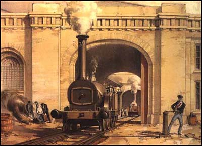
Image courtesy of http://www.spartacus.schoolnet.co.uk/railways, originally uploaded by Jimbo (Alan James Wellock).
Painted in 1836 by Joseph Cooke Bourne the above painting is just one of many lithographic railway work produced as bookplates for the London and Birmingham Railway, and the Great Western Railway. Unlike Turner, Bourne painted realistic style scenes not just for aesthetic value but also for research and recording. Bourne at the time was seen as a bit of a rebel as most artists, social commentators and writers such as John Ruskin and Charles Dickens were very critical of railway development. Bourne's work was seen to show "subjects of professional study, as scenes and compositions replete with picturesque effect and artistic character." Unlike Turner's work Bourne's studies best replicate the 'mass mechanical production' feeling of the Industrial Revolution, as he often depicts the people as well as the machines buildng the railways.
Final Year Studio - Research - Railway Romantacism - Rain, Steam andSpeed - The Great Western Railway

Image courtesy of http://www.spartacus.schoolnet.co.uk/railways, originally uploaded by Jimbo (Alan James Wellock).
Painted by Joseph Mallord William Turner, in 1844, the above painting is seen as one of his most famous. Depicting the Great Western Railway operating in terrible weather in his 'impressionistic' approach creates a great sense of speed and purpose. A notion that even nature cannot stop man's most brilliant triumph. Being the fastest mode of transport in the 19th Century meant the train was seen as the Concorde of its age, taking people and goods places faster and more efficient than ever before. As with most technology it was used commercially first but as the century progressed, businesses became aware that there may be an industry in transporting people, and so tourist industry was born. It seems hard to invision the impact the introduction of the train had a on a world dominated by horse and cart, people must have seen them as the 'ships of the land.'
Thursday, November 22, 2007
Final Year Studio - Research - Janek Schaefer - Extended Play

Yesterday I was fortunate enough to visit the Huddersfield Contemprary Music Festival's exhibition art pieces. One that stud out to me was Schaefer's 'Extended Play,' a tribute to the children who have had to endure times of war. A trio of retro record players, playing previously recorded instruments, play a coded score broadcasted by the BBC World Service to Polish Underground Movement in the second world war. There are three groups of three record players, each trio playing the instruments at a specific speed, thus creating a symphony and 'optimistic mass of sound.'
I was initially taken back by this artwork as it showed me the power of 'Associate Bandwidth' and the environment in which a piece is framed. For example the 'red' vibrant lighting of the gallery space really gives sense of war and times of trouble. Also even the aspect of laying out the record players in islands creates a great notion of overall collaboration between individual communities to create a greater good. My piece I feel will rely very much on the presentation and 'framing' of itself, it will be the use of both digital and analog media that will hopefully enhance the overall experience.
Wednesday, November 21, 2007
Final Year Studio - Research - The Lumieres - Arrival of the Train La Ciotat
Video courtesy of http://uk.youtube.com/
Throughout the past one hundred years the medium of film has a had a close bond with the depiction of trains and railway transport and communication tehcnology. This affair started with a film in 1895 when the Lumieres, two brothers of photographic development fame , second only to Kodak, started making movie cameras. The idea originated from their father seeing a Kinetoscope in Paris and telling his sons 'You can do better." Over the years they trialed and developed machines that evetually and successfully started caputring movement, their first movie being that of workers leaving the Lumiere camera factory. With this the idea came the notion that thanks to film, memory itself was no longer elusive, changing our relationship with memories forever. For example watching an old film you may realise that today all the cast have passed on, but to you at that moment in time they are very much live, singing and dancing.
The real effect of the moving image wasn't felt until 1895 when the Lumiere's, 'Arrival of the Train La Ciotat' was shown to an unexpecting audience. Above is this short film which seems very mundane by today's standards but back then it provoked a feeling of fright as the audience jumped back out of their seats as if they were going to be run over by the train. One factor for this was the point that unlike traditional art mediums that still distanced the viewer from interacting with the piece, the moving image actually 'simulated the visual experience of mental states - images of memory, dream and fantasy.' After the introduction of the moving image our mind had to change and is still changing as with the implementaton the computer, it has to learn new ways in which to interact with aesthetic information.
Sunday, November 18, 2007
Final Year Studio - Research - Screen Media - LCD Display

Image courtesy of http://www.airport-technology.com/, originally uploaded by Jimbo (Alan James Wellock).
The LCD or liquid crystal display screen is now the most common choice for new transport stations when wanting to display information fast and effectively. As these displays increasingly occupy our public spaces though we arrive at a dilemma. These screens thanks to new developments can be as large as they need to be and as mentioned below can display a vast amount of indormation in various formats. The problem though is the same in which I find with computer screens. They simply occupy a space in the environment and only manipulate the inner surface of the flat screen.
In today's world of Nintendo Wii style interaction this seems, as Mau states a cold, alien like medium for communicating information. Unlike its electro-mechaincal ancestors the data doesn't move or change the air both around and in the screen unit itself. You cannot hear the screen animating or physically pick up the data, it doesn't seem to have the same warmth and reliable feel of a Split-flap display screen. It is this factor of data interaction that worries me as the Internet takes over more of our environment, are we going to see a decrease of interaction when deciphering data and will our physcial world become like our digital, restricted to a 4:3 ratio rectangle.
Final Year Studio - Research - Screen Media - Associative Bandwidth Comparisant

Above is an image of both a ultra modern RGB LED screen (left) and a Split-flap display screen (right). Information and aesthetically wise it is obvious that the LED display is most effective when portraying cognitive data. It can simply display more information a second than the Split-flap display could ever dream of, but when applying Mau's 'associative bandwidth' theory to the equation we start to to see a shift in effect.
First of all due to the Split-flap display's physical animation quality you are naturally more drawn to that when navigating through the vast information on offer, thanks to its 'flip-flap' sound. Its warm 'associative bandwidth' and low data 'bandwdith' transfer actually adds to this appeal. Due to our traditionally linear methods of reading information we automatically decipher this kind of data portrail by reading it as we would a book. This is where the Split-flap display is still relevant today, and due to its extra 'associative bandwidth' it gives you the sense that you can touch, smell and hear the invdividually unique blocks of data manipulating and rising to the surface of the screen. This is simply not the case with LED screen as you are often left feeling cold, as the display seems to lack the environmental presence of its ancestor.
Final Year Studio - Research - Screen Media - LED Display

After the changable screen introduction of the Flip-dot display system the next natural step was to evolve this on and off mechanical thinking into the digital relm, the LED or light-emitting diode display allowed this. Now the most commonly used display technology on buses, trains and in transport stations, its changable but easy to to read factors has made it a highly common communication medium. Also relatively cheap compared to LCD display screens, it works simply by aluminating specific LEDs that occupy a grid around the screen, creating a series of characters and symbols.
Although this display lacks in actual mechanical animation, its 'associative bandwidth' is still increased due to the other implications we associate with it. LED screens remind us of old calculators and stadium score boards, mediums that can only cope a with a miniscule of data each second. It is this attribute that is very interesting, because when hooked up to a network this type of display can be probably one of the most effective at communicating any kind of literal information quickly and effieciently. The only 'bandwidth' restriction occurs when this medium is used to display images and animation, due to the size of LEDs a 'pixelated' style effect occurs where the image is compressed and restricted in its asethetic qualities.
Final Year Studio - Research - Screen Media - Rollsign Display

Image courtesy of www.hanoverdisplays.com and http://en.wikipedia.org/, originally uploaded by Jimbo (Alan James Wellock).
The traditional Rollsign display is seen as the father of the Split-flap and Flip-dot display systems. Using the simple motor movement of rotation, a long sheet of material is rolled and attached to a top and bottom roller. The mechanism then simply turns, by either a manual or motorised mechanism, changing the graphic shown in the window or screen.
Used on early buses and tube trains this kind of display has a nostalgic, metropolis feel. This is due to the fact that to change what the screen displays you have to physically change the graphic meaning its 'bandwidth' for communicating varied information is very low. It still though has a physical animation, not I don't think has a effective or as striking as the previous two displays but still high on 'associative bandwidth,' and adding to the interactive experience.
Friday, November 16, 2007
Final Year Studio - Research - Screen Media - Flip-dot Display

Image courtesy of www.hanoverdisplays.com and http://en.wikipedia.org/, originally uploaded by Jimbo (Alan James Wellock).
Probably the most common display used by the older transport sector which occupies both bus roofs and rural train stations. Also known as a Flip-disc display, they consist of a grid of small metal discs that are black on one side and yellow on the other. A microcontoller is used to flip the dots and inturn form characters and symbols. It is often compared to the similar 'core memory' process where both x and y axis wires are charged with a current, creating a magenetic field where they cross, which interacts with a small magnet on the discs edge. The desired discs are then flipped by using just a enough force to flip each one. This will take a couple of seconds to do the whole screen but it is said that the sound of the flip which occurs is 'quite distinctive.'
This type of display may be of use to me, as due to the analogue flipping nature of the screen refresh, it still makes a natural sound. This I think will still create higher 'associative bandwidth' than a simple LCD monitor. Hopefully this LED looking electro-mechanical medium will have the desired effect on the audience by portraying the high bandwidth procedure of navigating the Internet through a linear action low data bandwidth medium. It is this restriction to the instant visual access of the Internet that I am interested in controlling making the user aware of.
Final Year Studio - Research - Screen Media - Split-flap Display

Image courtesy of The Terminal and www.hanoverdisplays.com and http://en.wikipedia.org/, originally uploaded by Jimbo (Alan James Wellock).
The Split-flap display screen would be the preferred analogue output media for my idea, but as I am finding it is really hard to get hold of one, never mind a small portable version. But as I have said below it may be that I will have to make my own, and to do this it would be beneficial to look at the various electro-mechanical display media on offer today.
As the diagram above shows each charactor position has a collection of flaps, which are printed with various letters and symbols. Often found in airports and train stations they are sometimes known as 'Solari boards.' The advantage of this medium is that it is highly legible from any distance or angle, but has a narrow 'bandwidth' in the amount of information it can display due the restriction of having to have every charactor or word, that will be ever used, there in a position on the board.
It is this narrowing of the 'assocaitve' and information 'bandwidth' the display portrays in comparisant to todays high definition LCD screens that interests me. The 'flap' sound of the characters rotating, as shown in the title sequence of the film 'The Terminal,' creates a great sense of pattern and action. It feels a more reliable and warmer medium than a high information 'bandwidth' LCD display screen, due to its 'physicallity.'
Wednesday, November 14, 2007
Final Year Studio - Research - Split Flap Display Email

Above are some screen grabs of emails sent to the Research Department at the National Railway Museum in York. I asked whether they would know where I could aquire a 'Split Flap' Display Screen often used in train stations. Unfortunately they were unsure but told me to Goolge 'railwayana'. This gave me some interesting results of auction websites for railway station signs and memoribelia. I still couldn't find what I wanted, so it is looking as though I am going to have to make my own analogue textual display, which will also be useful as my idea progresses and I will be able to customize the mediums effect. A good thing to do will be to visit the National Media Museum in Bradford to understand the differences and similarities associated with analogue and digital display media.
Click here for NRM website
Final Year Studio - Development - Review #1

Yesterday I was asked to present a presentation that summerised both the research and ideas that I have done during the past couple of weeks of my investigation. Subjects I highlighted were 'Associaitve Bandwidth' theory, Initial Research, Initial Ideas, Research and Development. I explained my idea for the 'Datamotives' project and gained valuable feedback.
One interesting feedback idea was to investigate into other means in which I can show the travel and arrival of something. This doesn't just have to be by visual means but also maybe audio. This could take the form of a train sound increasing in volume until you hear it pull up outside the room. It could also be instead of visually mapping transportation of a website, I could use a tanoy system. Not unlike the ones in real train stations that recite when each train (website) is arriving. This could be really effective if done in away that replicates the broken up language used by public space information systems.
Another point brought up was the expect of making the visual mapping of each route, more interesting and 'life like.' To do this I could use various IP Addresses that the data travels through to show websites traveling through busy intersection points in the network. Another idea could be to use more than one computer and have websites travel around a small 'model intranet.' Doing this would emphasise my idea of having just one version of each website that can only be viewed on one computer at a time, almost treating the digital data as a physcially unique object.
Finally a more traditional area to look in to will be the simlarities and differences associated with our perception of what William J. Mitchell calls today's 'informatization' period and the pasts 'industrialisation' era. This idea could be influencial for how my idea will visually communicate itself and it may be worth researching deeper into the branding of old railway organisations and the art/romance surrounding traditional traveling means.
Final Year Studio - Research - Yonge St. Willowdale #4

The above image was initial inspiration to me, that partnered the theory of a media's 'Associative Bandwidth.' It is just one of a series of images taken by the photographer Robin Collyer. Here he takes a photograph of a visually busy high street and retouches the image to take out all the logos and text, just leaving the naked medium behind. It is really effective at revealing the various layers in which our world is visually made up and makes he viewer understand and identify the various media styles that make up the 'Global Image Economy' that surrounds them.
Click here for website
Wednesday, November 07, 2007

Monday, November 05, 2007
Final Year Studio - Development - Associative Bandwith
One of the core areas of my investigation into information interaction is that of a medium's 'Associative Bandwidth' or subliminal signal. Below is a quotation taken form Bruce Mau's 'Lifestyle' on the idea of 'Associtive Bandwidth' as one of the 'Twelve Strategies' of design.
'Describe print-based media in the terminology of new media and what becomes apparent is the extent to which “bandwidth” is carried by the non-text-based qualities of an object. The tactility, colour, material, smell, history, image and portability of an object produce what we call associative bandwidth or subliminal signal. All of these qualities inflect the meaning of an object. They make it speak of intelligence, consideration, contemporaneity, criticality, accessibility, or generosity. Although we may not focus ina cognitive sense on these qualities, the channel remains open. The real effect and power of the work emerge in the tension between our cognitive and associative engagement. Perhaps tthe most challenging constraint facing online design application, and the reason so much of it seems anemic or imporverished, is simpl the extremely narow bandwidth - effectivly stripped of all that subliminal signal.'
It is this idea of the difference between analog and digital interaction that I wish to investigate and in turn create a project that challanges the attributes that we normal associate with physical and digital interaction. Inter-twinning them to gain a greater understand of hwo we perceive the different styles of data interaction in our world today and the effect these have on how we store and access information biologically.
Click here for website
Final Year Studio - Research - Data Visualisation - Crank the Web

As my idea involves the idea of 'bandwidth' digitally, physically and metaphorically, I need to look at work that has challanged the transfer speed and in turn restriction of information. One such project is 'Crank the Web' created by Coin Operated. It allows the user to browse the Internet but makes them physically 'crank' the bandwidth and data speed at which the webpage is received. As shown above users type in a URL on the screen, hit the 'Enter' key and the Internet window opens. The wepage they require then travels through a buffer before displaying on the screen, byte by byte. The user turns the crank to increase the data speed and bandwidth which is also displayed on the screen, making text, images and sounds appear at various rates depending on the speed of the crank.
This project directly attacks the role of the user and the Internets promise of instant information. It combines the mechanical 'romanticism' of analog interaction with todays common 'click' digital telecommunication technology. This in a sense widens the 'Associative Bandwidth' of the medium as the user gets to touch, feel and control the information itself, much like a sculptor does. It is a very 'witty' project and potrays a 'real world' feel which I hope to replicate in my final peice.
Click here for link
Friday, November 02, 2007
Final Year Studio - Development - Sensor Interaction

As my idea is in its early development stage, I am thinking of using different means of data input and output. One alternative way to input data into the computer is to use sensors. There are two types of sensors, 3 pin resistors that the user can turn to widen the gap between the wire and thus narrow the current. The second are 2 pin sensors, such as light resistors (shown on the circuit above) and 'whisker resistors.' Both widen and narrow the current passing through them depending on a physical variable. All sensors work by sending data in the form of intergers to the Arduino board that is then processed using a previously installed program to send strings of numbers to a application such as Processing. Processing can use this data to then control onscreen and offscreen activities.
These alternative input methods will hopefully enhance my final dea and open up the 'associative bandwidth' of the medium being used, allowing the user to interact with my work through sensitivity rather than 'cold' buttons.
Final Year Studio - Research - Data Visualisation - Matchboxes

The above project is enitiled Matcheboxes but I cannot seem to gain any more information on the project. I have included it because of the way the program is animated. The blocks rotate and move around the text locations very naturally, but they have to travel along designated straight routes when entering and exiting the screen. This creates a great sense of the shapes being restricted from wondering, very much like a train is to the traintrack.
Click here for website
Final Year Studio - Research - Data Visualisation - Rhizone Navigation

Image courtesy of http://www.metaportaldermedienpolemik.net/, originally uploaded by Jimbo (Alan James Wellock).
This project is programmed in Processing and is a develpoment project for building data and visualising real-time realated information. In this case it is visualising a massive family tree in three dimension. It starts with director Bjarnason at the bottom and navigates upwards through various generations of his family. It features more than 3300 people and displays the relationships between each individual.
I have included this project as unlike the previous peices of art, the visualisation of data looks very analog and doesn't look cold and computer like. This helps to widen the effect on the viewer and in turn the 'associative bandwidth' of the medium. I also like the choice of colour, the red on the black in conjunction with the white gives a real sense of space and time, but also a grave feeling of natural death.
Click here for link
Subscribe to:
Comments (Atom)
