Monday, October 25, 2004

Studio - White


White
Originally uploaded by James Wellock.

R:219 G:209 B:195
White in this case I think represents authority and power. It tells you to stop rather than asking you, and althought the paint is dirty it still stands out set upon the cold, dark tarmac. It creates a great sense of nervenous to me as you are never quite sure where this dirty white lines will appear and sometimes this can be dangerous if they are not well displayed. Also though as well as being seen in my eyes as places of authority over road users they also give a sense of triumph by the underdog, in this case the pedestrian, meaning that cars simply have to stop, whatever, no excuses!

Studio - Orange


Orange
Originally uploaded by James Wellock.

R:166 G:85 B:66
This orange although warn and dirty reminds me of innocence and youth. It reminds me of the holiday to Florida, the sunshine state, I had when I was young. It reminds me of there because of all the orange fields that littered the long, wide highways of the state. It gives me a great feeling of inner happiness and creates a warm feeling inside, however cold it actually is outside.

Studio - Enivronmental Green


Green
Originally uploaded by James Wellock.

R:17 G:128 B:111
Now to me this green couldn't have been used on a more suitable object. For some reason I think it strongly represents the trees and plants of our planet. Its a green that I associate with environmental agencies and "treehuggers." It gives a great sense of cleanleness and calmness, which is interesting as this colour is situated on a litter bin in the inner urban streets of the city. Its a green used in everything to do with preserving the environment and even used by "BP" as their corporate colour alhtough technically they are harming the environment more than they are preserving it!

Studio - Royal Blue


Royal Blue
Originally uploaded by James Wellock.

R:36 G:73 B:118
To me royal blue reminds me of my middle school and post 16 days, playing for the college football team. It stirs up a feeling of anxiety and excitment that I used to feel before a game. A feeling of "I can't wait!" used to rise up inside me. You see royal blue was our team colour and when ever I see it, it reminds me of team work, responsibility, and the great times I had playing with me mates, on those cold winter, Saturday mornings.

Thursday, October 21, 2004

Spat. & Vis. Cult. - Illusions - Stereoscopes

I first came across the medium during an art and design project in year 12 and found the whole technique and culture behind it fascinating. Also I couldn’t believe how easy it was to do, using red and grebe/blue glasses, it was so simple. Basically the technique was to take an image and move the RGB layers in Photoshop until the overall image viewed through 3D glasses looked perspectively correct. So I was then surprised to find them at the Eyes, Lies & Illusions exhibition at the Hayward Gallery in London, but in an older form, the form big wooden stereoscopes. For me I really like the shear simplicity of the process of making a flat image into 3D and I can only imagine what kind of impact it must have had on an audience of 150 years ago.

You see created during the 19th Century stereoscopes were as common as televisions are today in the homes of the families of the 1800’s. They offered real views of distance lands and wild animals, people could never see in real life due to lack of long distance, rapid transportation. They were popular as Victorian travel guides, story tellers, educators and even pornography.

Stereoscopic pictures are pictures taken by a camera with two lenses. These pictures are then set 2.5 inches apart (the distance between the eyes of an adult.) The pictures although different may not appear different to the naked eye but when viewed through the viewer, they blend to form the illusion of a three dimensional image.

It was Sir Charles Wheatstone a physicist who in 1833 invented the first stereoscopic viewer. It worked by using pairs of reversed images and mirrors, allowing even large images to be viewed successfully. Since at the time photography hadn’t been invented, illustrations were used instead. In 1850 however stereoscopes with glass images were made available, although the quality of the image was low and price was high stereoscopes started to take off.

Photography gave the medium a massive boost has did the advent of a handheld viewer for users. You see before this stereoscopes were massive table mounted objects that needed a lot of space as well as money.


Spat. & Vis. Cult. - Illusions - Stereoscopes
Originally uploaded by James Wellock.

The Brewster

The portable market exploded in 1859 as inventers such as Oliver Wendell Holmes and Sir David Brewster started producing better and smaller devices. One such example is the one below, it’s called “The Brewster” and has a transparent piece of glass in the back viewer to allow light to pass through, allowing the viewer to see the glass and tissue pictures that were still popular among users.

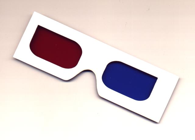
Unfortunately though by the 1920’s the popularity had died down and stereoscopes fell out of favour with the public has a popular form of entertainment, but during the 1950’s it was reincarnated in the from of 3D glasses. These glasses using red and green/blue filters over each eye, shown below, worked in roughly the same way, but the two images being printed or projected were tinted in either a red or green/blue tint. This then allowed the eyes to naturally put the two images together to form an individual three dimensional image. This technique was used in comic books, posters and films and was common during the 1950’s, sone such example is It Came From Outer Space, but sadly due to complaints of migraines and other health problems, was dropped as a mass form of entertainment yet again. Although it has started to raise its head again in both the theme park ride area, in the from of Terminator 2 and the child movie industry in the form of Spy Kids 3D Game Over. So the medium may not be quite dead and buried just yet.

Heres a link for a free pair of 3D Glasses and some cool images to view them with below.

The Sun
Edison
Fighter Jet
Spacemen

Spat. & Vis. Cult. - Illusions - Stereoscope Essay Bibleography

Page Wise
Stereoviewers.com
The Brewster
Eyes, Lies & Illusions Exhibition
3D Glasses
It Came From Outer Space
Spy Kids 3D Game Over.
Terminator 2 Ride
Free 3D Glasses
The Sun 3D
Edison 3D
Fighter Jet 3D
Spacemen 3D
Stereo Camera
Stereoviewer
Sir Charles Wheatstone

Monday, October 18, 2004

Studio - Cream


Cream Car.JPG
Originally uploaded by James Wellock.

R:201 G:212 B:206
Now to me a year ago cream was just a warmer version of white, to decorate your living room with or hallway. But 8 monthes ago this all changed as before a passed driving test I aquired a cream Rover 200. 6 monthes it stood on my drive wanting and waiting to be driven, and all I could do was simply walk past it and get the bus in the pooring, cold rain. I even had to wash it although it wasn't going anyway, and as you can imagine the torment was umbearable. To me this colour represents misery and frustration but also triumph and freedom as when i did pass me driing test all the heart ache and cold bus journeys were forgotten.

Studio - Dingy Grey


Dingy Grey.JPG
Originally uploaded by James Wellock.

R:227 G:221 B:225
Is there anything more neutral and unsensless than grey? If there is I haven't found it! Its basically just boring to look at and reminds me of a colour to appeal to a mass audience as no one really likes or dislaikes it, they all think it ok. It's a colour that represents the feeling that somethings alright, satisfactory, not bad. I'm using this image though as I feel it portrays me feeling on the colour perfectly. It makes me feel frustrated and unwanted, as many teadias nights I struggle on my PC at home to just get the damn thing to work.

Studio - "Toxic" Yellow


Toxic Yellow.JPG
Originally uploaded by James Wellock.

R:219 G:214 B:54
This yellow I feel is different from others, instead of being warm and uplifting, I think its cold and depressing. I call it "toxic" yellow as it reminds of the colour of the logos on barrels you see nuclear waste in on the television and in films. The colour just looks unatural and wrong, it reminds me of the time I went to a supermarket, starving and looking foward to a massive english breakfast only to find out that the yoke in the eggs was this horrible, processed looking greeny/yellow colour.

Studio - Brown/Red


RedBrown Autumn.JPG
Originally uploaded by James Wellock.

R:255 G:126 B:125
The brown/red of autumn gives the feeling that somethings coming to a end. It makes me feel cold and lifeless, I'd even go as far to say that it gives more sense of death than black does. Objects such as plants and leaves almost look lathargic as they try and hold onto the branches through the rainy windswept storms. The most weird thing is though, is that I think landscapes in the autumn look more impressing in different shades of brown and red, than they ever do in different shades of green. It could prove that beauty does come with old age?

Wednesday, October 13, 2004

Studio - Yellow


Studio - Yellow
Originally uploaded by James Wellock.

Image Source - R:255 G:255 B:1

Yellow I feel is a clour of youth, it reminds me of spring and new beginnings. Its a joyful, happy colour and it seems where ever I see it, it always puts a smile on my face. Personally it reminds me of new beginnings and uncharted territory. Its a colour that for me puts everything into perspective at the beginning of the summer.

Studio - Red


Studio - Red
Originally uploaded by James Wellock.

Image Source - R:177 G:40 B:56

Red to me is a colour of belief and pride, what ever it covers be it a car of magazine it always makes the object look crisp and clean. To me it reminds me of success and fullfilment, as its a very deep and almost bottomless looking colour. I feel I could stare at it forever and still not understand all the feelings it gives me.