It is said that the general public don’t have a voice, don’t have a say in what affects them as individuals. They are all the same and simply follow like sheep the main trend of the time not asking questions, not opposing what is told to them by distanced fat cats and aristocrats. Now, fifteen years ago I would have agreed with that, very rarely did the common individual get to talk to the nation and stick up for the regular “Joe” working the regular nine to five shift. But now everything has changed, the whole world has shrunk and allowed common individuals to become very powerful and manipulating, and you ask what has allowed this, the plane, the boat, the shuttle… The answer is the Internet, never in world history have so many different cultures, communities, and individuals talked to one another, spreading ideas and building friendships all over the globe. This has been done by various ways, but all are based on the notion of one computer being joined to another via the net, the Internet super highway.
One of the most popular ways of explaining yourself on the net is to create a personal homepage about yourself, your hobbies, your ideas, your ambitions, your problems, anything that your can dream of and want to share with the world. Many individuals do this, cancer patients, retired scientists, football fans, movie fans, etc. There are two types of personal homepages; the first is that of the author who wants to be “cool,” they often use stylish designed pages and comment on items and ideas that are in fashion at the current time. The other and more common is that where the author simply uses the homepage as a diary, gallery or journal of there life, including family and friends. The later is more common as the author doesn’t need any computing coding education to produce it; templates are available from providers such as Yahoo! Geocities and AOL. These then make the medium available to a much wider majority of the public and allow many people to express there ideas. The only problem though is that more often than not the personal homepage is simply an extension of the family album and ideas or problems with or for society are not discussed and brought to public attention. Blogs from such providers as Blogger also allow users to publish their ideas and reports on subjects, and even get comments from the readers on what they have just read. The only problem though with blogs is that they are usually too opinion driven and very rarely does one create a good, solid identity of the author.
Another and ever popular way of creating an online identity is that of the chat room. Chat rooms from such providers asMicrosoft and Talk City, allow any group of people to talk to each other anywhere in the world, with great ease and speed. For example some chat rooms that were present when researching this subject were “14-19teen,” “MarriedNLonely” and “Adult_Sexy_Flirts” to name a few. As you can see the chat rooms allow many people to discuss problems and ideas with other individuals who in turn can give support. One good adaptation of chat rooms is MSN Messenger, which I use on a daily basis. It’s a cross between chat rooms and email, and extremely useful when wanting to get in touch with friends. It’s basically just like texting service but doesn’t cost you money and allows you to send images, movies, sounds and most importantly allows you to create an online passport. You create a name, address, nickname, etc. and then talk to others over the internet. You can decide to be yourself or someone else, the choice is really yours and sometimes it is great fun to pretend to be somebody your not. For example many of times me and my friends have wound up others by pretending to be someone else, its cruel but really funny. Obviously though in serious situations this can be very dangerous and their have been many cases when individuals have come to harm when trying to physically meet fake online contacts. One amazing attribute though of chat rooms is the similarity between the text typed in by users and mobile phone text. For example “love” becomes “luv” and lots of laughs becomes “lol.” This nod back to mobile phone text style language is very apparent and at first on a large computer screen doesn’t look right. The reason for all this text style language I believe is down to the old notion of “coolness,” you see as mobile phone text language is seen as a young, modern phenomenon, older individuals adopt this kind of language in chat rooms to portray a “hip,” “cool” image of them self’s to others. As well as being places for the young and wanting to be young individuals to get together, chat rooms have a better purpose. They allow professionals such as scientists, from all over the world to talk to each other and discuss ideas and results. Allowing instant recognition and theories on important experiments and technological developments. Also fans of different genres can interact with each other often to their relief to actually find someone with same amount of interest in something as them. This doesn’t produce anything useful but allows individuals to talk comfortable between each other without having the feeling that someone will laugh at the views.
Sunday, December 12, 2004


The above examples of online identity as you can imagine are vastly text based, and don’t describe visually what a person is like. It is said that in the physical world we think how a person looks is much more descriptive of them self's than what the say, for example it is said that it takes us just four seconds to find out visually if you like or dislike someone. So it is only natural then that the next step was to create online virtual worlds to allow users to fully represent themselves to the world. Probably the best and most popular example of this is the Habbo Hotel, here internet users can actually sign in to a virtual hotel and communicate with other individuals, visually. It allows you to create your own Habbo (character) and then move around the hotel interact with other habbos. For example the above scene is that of the Christmas stage for a play and you can then interact with all the individuals in the room, and ask them to be your friend. You can even buy credits using physical money, so that you can buy furniture and clothes at the hotel as well as swim in the swimming pool and buy drinks at the bar. The exchange rate for these credits when I was dong my research was 10p for 1. Now this is obviously the way Habbo make the money to produce the website, but also it offers a great opportunity for individuals to live out parallel or totally opposite lifestyles. Allowing them to see what their lives are like in the eyes of other individuals. They can experiment with new chat up lines without physically being rejected which is also another key factor. This you see is interesting as it also happens in homepages and chat rooms; people become braver and more outgoing with their comments when they can’t physically see the person they are talking to. It’s the same phenomenon that appears in cars on the road, people act tough and confront people from within their cars with such expressions as the “V” sign, because they feel secure, but they would never dream of doing it when just walking past someone in the street. This then means that people talking to each other over the internet are in a sense more truthful and because they can construct opinions and arguments, they can be more constructive in their comments. It also works the other way though; the individual being commented upon can just as easily ignore the individual commenting on them. This also wouldn’t happen in real life as it would be seen to be rude to ignore someone, but yet again it is seen to be alright to do it on the “faceless” Internet.
The amazing thing though relating back to the Habbo Hotel is how much the visual representation of the character effects people’s perception of you. I created a stupid looking character and hardly anybody wanted to be my friend or talk to me but when I created a simple normal looking character, lots of people did. This obviously backs up the theory that people simply judge you one how you look, and the first four seconds of the first meeting are the most important.
So as you can see there are a variety of ways to create an online identity and many more aside but they all have the same problem, security. The very thing that makes the internet great for creating identities and allowing users to easily publish there views and opinions, is its greatest downfall. The problem is monitoring, there is no individual body such as the Police in the physical world that continually monitors the content of webpages. Homepage providers such as Yahoo! individually check homepages before publishing them but I’m sad to say not all do. This then allows individuals who may have angry opinions and evil personalities to talk to each other and even more dangerously, plan with each other. Terrorist organisations can promote their hate and evilness, that infects the minds of others creating dangerous, focused people of hate. Although occurrences where internet based violence has occurred are few and far between, in the future it may be different and this is only emphasised by the worlds governments who are creating vast teams to monitor and tackle inappropriate webpages of evil minded individuals. So as the internet becomes more and more available to more and more people only time will tell what affect online identities and opinions will have on our physical lives.
Bibliography
Web. Studies (David Gauntlett and Ross Horsley, 2004, Arnold, ISBN 0-340-81472-1)
Yahoo!
AOL
Microsoft
Talk City
Habbo Hotel
Wednesday, December 08, 2004
How Colour can be useful to me as a Graphic Designer (Images below essay and also avaliable through links)
(To view all images below for the essay you will have to click on the Decemeber 2004 link on the right)
Colour what does it mean to us? It’s the stuff of emotion, passion, religion and even magic. It drives societies all over the world and allows them to communicate between themselves and each other. Unlike literacy it is something that doesn’t have to be taught, it’s just your gut feeling, your instincts. It’s this then due to the fact that different languages all over the world talk different dialects that make colour so important in universal communication. It’s used by graphic designers to produce persuasive and entertaining communicational designs, just as in the way adjectives are used by writers to emphasise text. Nowadays thanks to the computer more and more colours are available cheaply to designers to reproduce their creative concepts. To me as a graphic designer it is then really important to grasp the whole notion of colour theory, psychology, history and usage.
Firstly I must look at colour theory. This involves looking at the most basic reproduction of colour and its relationships within colour wheel. Colour theory through out time has not just been studied by artists but also philosophers and scientists, Da Vinci, Goethe and Newton to name a few. Probably the best way to display colour theory is by using the Bauhaus movement leaders, Johannes Itten’s example. Fig. 1. it is today the most basic building block for mixing pigments and paints, it consists simply of twelve colours, primary, secondary, and tertiary. The primary colours which are red, blue and yellow shown in the inner triangle are the most simple as no two or more colours can be mixed to create them. A secondary colour is then one that is created by mixing two primary colours for example red and yellow mixed make orange, these are shown in the middle ring. Finally a tertiary colour is then made by mixing a primary colour with a secondary colour. For example yellow and green when mixed create a yellow/green colour; these colours are shown in the outer ring.
Just as important as the basic colours though are the relationships that are between them and for me as a graphic designer I must use these relationships to emphasise the desired meaning of the design:
Monochromatic (Fig. 2.)
It is basically a scheme of a single colour and looks clean and elegant, creating a soothing feeling. It is easy on the eyes and is good at creating overall moods in a design but due to this it then lacks highlighting abilities. As you can see in Fig. 3. it is easy to manage and balanced but lacks visual contrast and punch.
Analogous (Fig. 4.)
This scheme then uses the colours adjacent to each other on the colour wheel, where one is dominant and the other simply enriches the design. So as you can see in Fig. 5. its richer than the monochromatic colour scheme but still lacks contrast.
Complimentary (Fig. 6.)
This scheme uses two colours that are opposite each other on the colour wheel and is extremely high contrasted. Fig. 7. shows that it offers strong contrasts and draws maximum attention but is harder to balance.
Triadic (Fig. 8.)
This scheme then uses three colours, all equally spaced around the colour wheel, and is popular with artists as it offers high visual contrast as well as balance and colour richness. As shown in Fig. 9. it offers contrast as well as balance but not as much contrast as the complimentary colour scheme, note though that it is the triadic colour scheme of a mixing colour wheel, red, blue and yellow.
These relationships can then be modified by altering the saturation and lightness of each hue (colour). The saturation of a colour or hue is simply the vibrancy of it, for example a bright red fire engine is heavily saturated while some dull red bricks are weakly saturated. Lightness then obviously refers to the brightness of the colour, for example pink is a lightness of red. This is done by simply adding either white to lighten the hue or black to darken it.
Also to a graphic designer it is important to know the two main types of colour used in design, RGB and CMYK. RGB is simply red, green and blue, the colours that our eyes detect and what monitors and televisions output. CMYK though standing for cyan, magenta, yellow and black are the actual colours that are used in the printing of the designs. This then means that if the design is going to be published on screen everything must be done in RGB but if it is going to be published in print everything must then be CMYK.
Secondly in conjunction with the actual use of colour the whole issue of psychology must be taken into account, as different colours stimulate different feelings meaning as a designer you must fully understand these different emotions to take full advantage of them. Here are some colours and their different psychological feelings:
Black (Fig. 10.)
As black reflects no light or colour it is seen as the colour of death and is used in funerals as the colour for mourning. Graphic designers usually use it as a receptacle and contrast to other colours being used and is often given the back seat in the design. In contrast though in other parts of the industry such as product design it is used to show newness and high technical abilities. It’s a very negative colour as people see it to be the colour of revolt, stubburness, inflexibility and this is why it used a lot in protests and propaganda.
Green (Fig. 11.)
Green is said to be firm, constant, proud and self-contained but resists change and always seeks recognition. People who often wear green are seen to by idealising self-image and seek a longer more useful life for themselves and others. It’s a very natural colour and is universally seen as the colour of peace but also as the colour of greed thanks to its moneyed connotations. Fig. 12. using the analogous colour scheme of green then shows this. The lime green symbolizes the modern money ruled world we live in today, it’s a sickly, vulgar colour. While the dark natural green symbolizes nature and where we come from and what we are now doing to it. The analogous colour scheme works perfectly as it shows all the negativity that beds itself in the so called “peaceful” colour of green.
Red (Fig. 13.)
Red in contrast is seen as impulsive, competitive and strong. It urges for achievement and success over the other colours, seeking excitement. Objects that are red are seen to be intense, rich, experienced and passionate. It’s the colour of love and also danger, it is simply the most powerful of all the colours, be it used to be positive or negative. It is this then that confused me to just what does red mean to me and everyone else. I represented this in Fig. 14, it shows how powerful red can be at getting the message across. It shows that out of all the colours it’s the one we are most in contact with everyday, its one the one most in contact with our emotions be them good or bad. To show this conflict within the colour itself I then decided to use the complementary colour to emphasise this fight.
Blue (Fig. 15.)
Blue is then seen to be a calm, ethical and a orderly colour. It creates feelings of harmony, tradition and is seen to minimise disturbance. To me blue is the colour of nature, pureness and beauty. It is this then in Fig. 16. that I wanted to create so I used the beautiful shape of a dolphin in conjunction with the shapely, powerful contours of the wave. Here the analogous colour scheme was used to show the opposite feeling of the green composition, one of overwhelming positivity and beauty within the colour.
Yellow (Fig. 17.)
Yellow to people gives off the feeling of happiness, achievement and importance as well as danger and caution. It’s modern, ambitious and is seen to be focused on the future. The most interesting thing to me though was the similarities and contrasts of the colour within nature and humanity. Fig. 18. shows this, in nature yellow means caution, insects and plants use it to warn others, but in humanity it is simply taken to the extreme, it basically means danger and lots of it. This is due to its vibrancy and verossity when used, it’s the colour of mass energy, for example in the form of explosions.
A good example of research into these notions of colour stimulating feelings is Max Lücher’s Colour Test which studied the different colour’s personalities. This test found out that each colour creates a different feeling and showed that it is useful for a graphic designer’s to know which colours stimulate which feelings as they often are trying to appeal to a common group of individuals. The above colours are just a few tested and these results give designers guidelines as to what to use in certain designs. It is important to note though that these are common feelings and not individual ones that can often sometimes differ due to experience and perception.
So to conclude as a graphic designer colour is very important to me and to use it well is the key factor as it is this that often makes you either a good or bad graphic designer and your designs brilliant or rubbish.
Bibliography
Colour for Professional Communicators
(André Jute, Batsford, ISBN: 0-7134-7088-7)
Big Colour (Roger Walton, ISBN 0-688-16939-2)
Colour Wheel Pro
Colour Matters
Dutch Flower
Designed
Designers Republic
Slattoff + Cohen Partners Inc.
Bulletproof Design


Tuesday, November 30, 2004
Sunday, November 28, 2004
Studio - Green Composition - The World Today...

This composition first started off by me thinking what colour I would use to represent the world today. I went through various colours, red, blue, yellow, purple, orange but ended up at green. Personally to me it’s a colour great distress because I believe it to have both good and bad connotations.
In the composition above I've tried to create the conflicting nature of green, the very urban scene of skyscrapers and money is put to the background as we see a tree dying from what these tools of humanity have set upon the world. People don’t care any more. All they care about is themselves and money; as long as they’re alright the rest of the world can burn as far as they’re concerned. I don't understand how it can give people strong sensations of being natural and clean while also to others representing greed and dirtiness. I worked out that I don't know which side of green to be on yes it is natural but also it is rich and almost sickening.
Colour psychology states that green is calming and relaxing but while I was creating the composition I found my self feeling a bit unwell, which in turn started off a cracking headache. I think this was due to simply revolting toxic green being used, even to look at it for longer than 10 seconds hurts you eyes.
Monday, November 22, 2004
Studio - Red/Turquise Composition - Complementary Colour Scheme - Red: Love or Danger?

This particular composition has been designed to show the effect of the complementary colour scheme. Here red and its opposite colour on the colour wheel, turquise have been used to show conlfict and opposition. I've tried to display the theme of love and danger visually, as it interested me that the colour red can be so contrasted in connotation. If you ask someone to say a feeling red gives them they could say love, passion, careness but they could also easily say danger, evil and wickedness. Its this astonishing difference that made me want to use this specific colour scheme as I feel it reflects the colour red perfectly.
This colour scheme is extrmemly useful when you want something to stand out, it offers a massive amount of contrast. Due to this then it is alot harder to harmonise than any other colour scheme and is mostly used when a direct simple order or message is needed to be displayed.
Colour psychology states that red is the most emotionally intense colour of all, for example it is the colour of love. It is an extreme colour and it is advised that it should be not worn in moments of negotiation as it can make the other party feel uncomfortable. More often than not red will make an object look ten times better than it would in any other colour but this can have a down side, for example statistics show that more red cars are stolan than any other cars in other colours.
Tuesday, November 16, 2004
Studio - Pimpy Purple

Purple
Originally uploaded by James Wellock.
R:121 G:120 B:190
Purple to me is a colour of wealth for some strange reason. It always gives me the impression of "granduar" and "pimpness." I say it gives me an impression of "pimpness" as I always associate it with leopard skin rugs etc. Purple I think is an unusual colour as it is neither masculine or feminine it sits in the middle, both men and woman can wear purple and get away with it. I think its both calming and enriching to look at, it looks on the out side as a nice, pleasent soft colour but as you delve deeper into it, it turns dark and mysterious.
Monday, November 08, 2004
Studio - Citrus Green

Citrus Green
Originally uploaded by James Wellock.
R:76 G:211 B:214
I decided to put this green in my colour diary simply because I think it looks totally tropical. Its situated on a car I walk past everyday and even when its pooring down with rain it still reminds my of more tropical climates and for some stange reason Lilt! You can imagine it colouring a jungle or beach out in the Carribian, it gives a greats sense of warmth although in reality the blueness can give a slight sense of coolness as well.
Wednesday, November 03, 2004
Studio - Analogous Colour Scheme - Blue Composition - Flippers?

Here I have used the analogous colour scheme of blue which includes the dark and light versions of the colour, to create a rich, vibrant, strong image. The composition was influencd by the BMW 1-series advert from the television. Here simple images and colours such as black and green are used to create a high impact, exciting piece of multimedia. Blue to me reminds me of the sea and the shear power and life of it. This is then what I've tried to replicate in the composition. The arcs of the image are intentional to describe the crushing power of the ocean. This is then contrasted by the leaping dolphin, symbolising life, showing that life can prosper in the most hostile of places.
Blue as I said is the colour of the ocean and even the sky, it is all around us and due to this it is one of the most popular colours. It causes the opposite reaction to red, it is peaceful and a tranquil blue will produce calming chemicals in the body calming people down. Blue simulates loyality and due to this is a popular colour to wear to a job interviews. Its also stated that people work better in blue environments, for example weightlifters are able to lift heavier weights in blue gyms.
Monday, November 01, 2004
Studio - Yellow Composition - Caution vs Danger

Here is a my own interpretation of the colour yellow. To me yellow is a colour of youth and happiness but after thinking about it yellow only really represents happiness in nature and within humanity itself it is a colour of great danger and harm. So in this composition I have tried to represent the conflicting feelings of the two groups. For example in nature yellow is used on wasps to show caution but in humanity it is used on such logos as toxic chemicals to show a much greater and stronger feeling of intense danger. Yellow is one of the primary colours and a building block for other more complex colours, its shear simplicity birghtens up the environment and used in conjucntion with green, one such exmaple are daffidils, gives a great sense of calmness and rest. It is this I wanted to get across to the viewer as it seems whatever yellow is in nature, humanity as taken it to its extreme for their own greedy, gain.
Studio - Aqua Blue

Aqua Blue
Originally uploaded by James Wellock.
R:32 G:140 B:205
This tropical blue always for some reason reminds me of the film Finding Nemo. Its such a beutiful, intoxicating colour and one that as well as calming is also warming. Its easy on the eye and is a colour that whatever it is covering makes the object much more vibrant than it otherwise would be. It reminds you of past holidays lounging about on the beach and cooling of in the crystal clear, blue sea.
Studio - Black

Black
Originally uploaded by James Wellock.
R:30 G:37 B:47
Black to me is a colour of anxiety, you never quite know where you stand with black. In one sense it can be a colour of purity and cleanleness as there is no other colour mixed in to attract your attention. But on the other hand it can be a colour of great fear and mystery. It always reminds me of a nightmare I had once, it was one in which I thought I'd woken up from a dream, only to find that somekind of "Shadowman" was in my bedroom holding me down, not letting me get up. I tried to move and shout for help but nothing came out, then just as I thought I was done for I actually did wake up, to my relief. As you can imagine it took me a while to get to sleep after and I'm not ashamed to admit I did end up sleeping with the light on!
Studio - Fiery Orange

Firey Orange
Originally uploaded by James Wellock.
R:175 G:119 B:58
I call this firey orange because in autumn this tree outside my house always gives my a feeling of warmth, even on the coldest days of the year. To me with its wild, windswept shape and thin long leaves, it looks like a fire rising and burning in the cold winter winds.
Monday, October 25, 2004
Studio - White

White
Originally uploaded by James Wellock.
R:219 G:209 B:195
White in this case I think represents authority and power. It tells you to stop rather than asking you, and althought the paint is dirty it still stands out set upon the cold, dark tarmac. It creates a great sense of nervenous to me as you are never quite sure where this dirty white lines will appear and sometimes this can be dangerous if they are not well displayed. Also though as well as being seen in my eyes as places of authority over road users they also give a sense of triumph by the underdog, in this case the pedestrian, meaning that cars simply have to stop, whatever, no excuses!
Studio - Orange

Orange
Originally uploaded by James Wellock.
R:166 G:85 B:66
This orange although warn and dirty reminds me of innocence and youth. It reminds me of the holiday to Florida, the sunshine state, I had when I was young. It reminds me of there because of all the orange fields that littered the long, wide highways of the state. It gives me a great feeling of inner happiness and creates a warm feeling inside, however cold it actually is outside.
Studio - Enivronmental Green

Green
Originally uploaded by James Wellock.
R:17 G:128 B:111
Now to me this green couldn't have been used on a more suitable object. For some reason I think it strongly represents the trees and plants of our planet. Its a green that I associate with environmental agencies and "treehuggers." It gives a great sense of cleanleness and calmness, which is interesting as this colour is situated on a litter bin in the inner urban streets of the city. Its a green used in everything to do with preserving the environment and even used by "BP" as their corporate colour alhtough technically they are harming the environment more than they are preserving it!
Studio - Royal Blue

Royal Blue
Originally uploaded by James Wellock.
R:36 G:73 B:118
To me royal blue reminds me of my middle school and post 16 days, playing for the college football team. It stirs up a feeling of anxiety and excitment that I used to feel before a game. A feeling of "I can't wait!" used to rise up inside me. You see royal blue was our team colour and when ever I see it, it reminds me of team work, responsibility, and the great times I had playing with me mates, on those cold winter, Saturday mornings.
Thursday, October 21, 2004
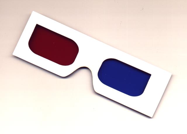
Spat. & Vis. Cult. - Illusions - Stereoscopes
I first came across the medium during an art and design project in year 12 and found the whole technique and culture behind it fascinating. Also I couldn’t believe how easy it was to do, using red and grebe/blue glasses, it was so simple. Basically the technique was to take an image and move the RGB layers in Photoshop until the overall image viewed through 3D glasses looked perspectively correct. So I was then surprised to find them at the Eyes, Lies & Illusions exhibition at the Hayward Gallery in London, but in an older form, the form big wooden stereoscopes. For me I really like the shear simplicity of the process of making a flat image into 3D and I can only imagine what kind of impact it must have had on an audience of 150 years ago.
You see created during the 19th Century stereoscopes were as common as televisions are today in the homes of the families of the 1800’s. They offered real views of distance lands and wild animals, people could never see in real life due to lack of long distance, rapid transportation. They were popular as Victorian travel guides, story tellers, educators and even pornography.
Stereoscopic pictures are pictures taken by a camera with two lenses. These pictures are then set 2.5 inches apart (the distance between the eyes of an adult.) The pictures although different may not appear different to the naked eye but when viewed through the viewer, they blend to form the illusion of a three dimensional image.
It was Sir Charles Wheatstone a physicist who in 1833 invented the first stereoscopic viewer. It worked by using pairs of reversed images and mirrors, allowing even large images to be viewed successfully. Since at the time photography hadn’t been invented, illustrations were used instead. In 1850 however stereoscopes with glass images were made available, although the quality of the image was low and price was high stereoscopes started to take off.
Photography gave the medium a massive boost has did the advent of a handheld viewer for users. You see before this stereoscopes were massive table mounted objects that needed a lot of space as well as money.

Spat. & Vis. Cult. - Illusions - Stereoscopes
Originally uploaded by James Wellock.
You see created during the 19th Century stereoscopes were as common as televisions are today in the homes of the families of the 1800’s. They offered real views of distance lands and wild animals, people could never see in real life due to lack of long distance, rapid transportation. They were popular as Victorian travel guides, story tellers, educators and even pornography.
Stereoscopic pictures are pictures taken by a camera with two lenses. These pictures are then set 2.5 inches apart (the distance between the eyes of an adult.) The pictures although different may not appear different to the naked eye but when viewed through the viewer, they blend to form the illusion of a three dimensional image.
It was Sir Charles Wheatstone a physicist who in 1833 invented the first stereoscopic viewer. It worked by using pairs of reversed images and mirrors, allowing even large images to be viewed successfully. Since at the time photography hadn’t been invented, illustrations were used instead. In 1850 however stereoscopes with glass images were made available, although the quality of the image was low and price was high stereoscopes started to take off.
Photography gave the medium a massive boost has did the advent of a handheld viewer for users. You see before this stereoscopes were massive table mounted objects that needed a lot of space as well as money.
Spat. & Vis. Cult. - Illusions - Stereoscopes
Originally uploaded by James Wellock.
The Brewster
The portable market exploded in 1859 as inventers such as Oliver Wendell Holmes and Sir David Brewster started producing better and smaller devices. One such example is the one below, it’s called “The Brewster” and has a transparent piece of glass in the back viewer to allow light to pass through, allowing the viewer to see the glass and tissue pictures that were still popular among users.
Unfortunately though by the 1920’s the popularity had died down and stereoscopes fell out of favour with the public has a popular form of entertainment, but during the 1950’s it was reincarnated in the from of 3D glasses. These glasses using red and green/blue filters over each eye, shown below, worked in roughly the same way, but the two images being printed or projected were tinted in either a red or green/blue tint. This then allowed the eyes to naturally put the two images together to form an individual three dimensional image. This technique was used in comic books, posters and films and was common during the 1950’s, sone such example is It Came From Outer Space, but sadly due to complaints of migraines and other health problems, was dropped as a mass form of entertainment yet again. Although it has started to raise its head again in both the theme park ride area, in the from of Terminator 2 and the child movie industry in the form of Spy Kids 3D Game Over. So the medium may not be quite dead and buried just yet.
Heres a link for a free pair of 3D Glasses and some cool images to view them with below.
The Sun
Edison
Fighter Jet
Spacemen
Spat. & Vis. Cult. - Illusions - Stereoscope Essay Bibleography
Monday, October 18, 2004
Studio - Cream

Cream Car.JPG
Originally uploaded by James Wellock.
R:201 G:212 B:206
Now to me a year ago cream was just a warmer version of white, to decorate your living room with or hallway. But 8 monthes ago this all changed as before a passed driving test I aquired a cream Rover 200. 6 monthes it stood on my drive wanting and waiting to be driven, and all I could do was simply walk past it and get the bus in the pooring, cold rain. I even had to wash it although it wasn't going anyway, and as you can imagine the torment was umbearable. To me this colour represents misery and frustration but also triumph and freedom as when i did pass me driing test all the heart ache and cold bus journeys were forgotten.
Studio - Dingy Grey

Dingy Grey.JPG
Originally uploaded by James Wellock.
R:227 G:221 B:225
Is there anything more neutral and unsensless than grey? If there is I haven't found it! Its basically just boring to look at and reminds me of a colour to appeal to a mass audience as no one really likes or dislaikes it, they all think it ok. It's a colour that represents the feeling that somethings alright, satisfactory, not bad. I'm using this image though as I feel it portrays me feeling on the colour perfectly. It makes me feel frustrated and unwanted, as many teadias nights I struggle on my PC at home to just get the damn thing to work.
Studio - "Toxic" Yellow

Toxic Yellow.JPG
Originally uploaded by James Wellock.
R:219 G:214 B:54
This yellow I feel is different from others, instead of being warm and uplifting, I think its cold and depressing. I call it "toxic" yellow as it reminds of the colour of the logos on barrels you see nuclear waste in on the television and in films. The colour just looks unatural and wrong, it reminds me of the time I went to a supermarket, starving and looking foward to a massive english breakfast only to find out that the yoke in the eggs was this horrible, processed looking greeny/yellow colour.
Studio - Brown/Red

RedBrown Autumn.JPG
Originally uploaded by James Wellock.
R:255 G:126 B:125
The brown/red of autumn gives the feeling that somethings coming to a end. It makes me feel cold and lifeless, I'd even go as far to say that it gives more sense of death than black does. Objects such as plants and leaves almost look lathargic as they try and hold onto the branches through the rainy windswept storms. The most weird thing is though, is that I think landscapes in the autumn look more impressing in different shades of brown and red, than they ever do in different shades of green. It could prove that beauty does come with old age?
Wednesday, October 13, 2004
Studio - Yellow

Studio - Yellow
Originally uploaded by James Wellock.
Image Source - R:255 G:255 B:1
Yellow I feel is a clour of youth, it reminds me of spring and new beginnings. Its a joyful, happy colour and it seems where ever I see it, it always puts a smile on my face. Personally it reminds me of new beginnings and uncharted territory. Its a colour that for me puts everything into perspective at the beginning of the summer.
Studio - Red

Studio - Red
Originally uploaded by James Wellock.
Image Source - R:177 G:40 B:56
Red to me is a colour of belief and pride, what ever it covers be it a car of magazine it always makes the object look crisp and clean. To me it reminds me of success and fullfilment, as its a very deep and almost bottomless looking colour. I feel I could stare at it forever and still not understand all the feelings it gives me.
Thursday, October 07, 2004


Wednesday, October 06, 2004

Wednesday, September 29, 2004
Studio - “Graffiti – Art or Vandalism” Research Sources
Books
Vandalism & Graffiti - The State of Art
Frank Coffield
Page 62-68
ISBN 0-903319-56-X
Websites
Dictionary.com
Big Pond
Artists
The Fabulous 5ive
Banksy
Downey & Darius Jones
Exhibtions
Ill Communication II Urban Exhibition 2004
Urbis
Manchester
Vandalism & Graffiti - The State of Art
Frank Coffield
Page 62-68
ISBN 0-903319-56-X
Websites
Dictionary.com
Big Pond
Artists
The Fabulous 5ive
Banksy
Downey & Darius Jones
Exhibtions
Ill Communication II Urban Exhibition 2004
Urbis
Manchester
Studio-“Graffiti – Art or Vandalism”
First and foremost what is graffiti? Dictionary.com refers to it as "A drawing or inscription made on a wall or other surface, usually so as to be seen by the public." It is a type medium that’s wild and unexpected, that reaches everyone, regardless of their social class or background. Although graffiti as a medium of communication is very successful in some cases, commenting on such things as political and social issues, its still being debated whether or not its either fresh, modern art or petty, scruffy vandalism.
Some such as politicians and the general public would argue that its shear vandalism. They declare the obscene, racist slogans used in graffiti make peaceful, relaxing places such as public parks places of intolerance, violence and distress. It destroys owner’s properties and steals away their right to have something nice and clean. This in conjunction with the cost in repairs means in general it is seen as an annoyance and is unwanted by the public.
On the other hand users of graffiti, urban youth communities and myself would support the medium as an art form. I argue that the colour, humour and vibrancy of graffiti gives the darkest physical areas within our society, life. It allows everyone to have their own space and express themselves in a healthy creative way, safe in the notion there are no guidelines, allowing them to feel free and untethered. It basis itself on the fact that the street is the best place to get across feelings, be them political or simply social. The artists replicate the tatcis of cooperate companies and governmental propaganda who paste visuals all over the urban background, to fight back the worlds powers the only way they can. This is because coming from lower class backgrounds its very unlikely they will ever be in government and this then makes them feel the only way to get their views across is by portraying them in the streets in the form of graffiti.
I would even go as far to argue that it as evolved as art has done. It started off as simple scribbles and now has morphed into a form of sophisticated calligraphy. It’s now so popular with the youth culture that famous advertisers such as Charles Saatchi use it in their designs to communicate with the young urban audience. Not only now is it used in graphic design but also to decorate urban redevelopments. One example is a multi story car park in Southampton that was not used by the public because of its scruffy looking nature. So instead of painting the walls a nice clean white the Services Department hired local graffiti artists to decorate the walls in their own individual style. This can be done in various simple ways either by producing a one off piece in their own style of thier own signature; this is called a “piece.” Examples include not just individual artists but also groups, for example The Fabulous 5ive in New York who simply use spray paints to create massive, vibrant murals. Or by writing their name in a much simpliar style which are called “tags,” a good example of this is Bansky’s work. He uses simple stencils and spray paints to tag various areas all over the world, and in turn has become quite famous within the subculture its self. Another type of graffiti and the most expressive is "bombing." This involves the artist painting and area or creating somekind of set of sculptures to give the place a certain kind of feel. Examples include Downey and Darius Jones' work where they not only use spray paint but also models, sculptures and exisitng signage to either turn the meaning of the object on its head or get an important issue accross. All in all it is a way for the powerless youth to express their deepest feelings about society today.
I believe that it depends what your social and cultrual background is, to whether you see graffiti as an art from or not. For example a Roberts Seminar in 1990 debated whether graffiti could be accepted as art. It came to the conclusion that “pieces” and “tags” can be seen as art as their express visually using colour and shape what the artists feels. While mindless scribbling in marker pen is vandalism as most of the time it is to simply express racist, sexist views. Confused? Frank Coffield states “A clear distinction ought to be made between these two types of graffiti but rarely is.” Ref. “Vandalism & Graffiti - The State of Art – Frank Coffield page 62.”
Coffield is right, there does need to be a distinction between the two. I believe that graffiti is an art form; it allows artists as other mediums do to express them self’s and is no different than painting on to a canvas or sculpturing out of marble. This is now starting to be seen by the arts community and more and more galleries are holding urban exhibitions, one such example is the Ill Communications II exhibition at the Urbis gallery in Manchester in 2004. Yes colourful, meaningful graffiti is an art form but scruffy, scribbled graffiti I feel is not and I think there needs to be somekind of rock solid distinction between the two.
Tuesday, September 28, 2004
Subscribe to:
Comments (Atom)

%20(lc).jpg)